Shared Image
Prompt
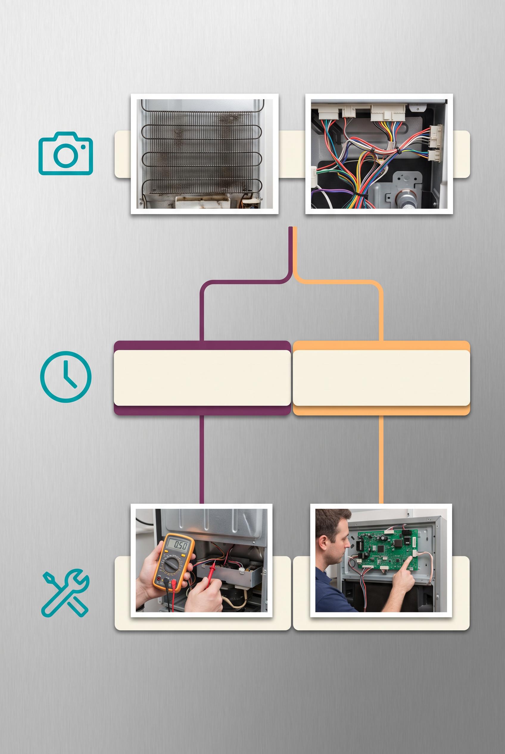
Create a commercial-quality educational Pinterest graphic in a vertical 2:3 composition for an independent appliance repair service. Show a magnetic tile decision tree on a clean workshop board, using realistic appliance detail photos, friendly abstract icons, arrows, and three branching stages that explain how to identify an issue and choose a next step. Use electric teal, plum, apricot, ivory, and graphite. Use blank tile shapes and abstract symbol marks only, with no legible words or numbers. AI-modified downstream asset, no real brands, no trademarked characters, no watermark, no unintended readable text. Corrective regeneration attempt 4. Produce a materially revised image, not a near-duplicate of an earlier variant. Preserve the successful subject, palette, lighting, focal hierarchy, and commercial polish from the original brief while correcting every issue below. Mandatory corrective instructions from the most recent visual QA: Preserve the polished vertical 2:3 refrigerator-board composition, clean lighting, teal/plum/apricot/ivory/graphite palette, realistic appliance detail photos, magnetic tiles, and central focal hierarchy. Rebuild the layout as exactly three clearly separated horizontal or vertical sequential stages with one unambiguous top-to-bottom path: first an observation/photo stage using only a camera pictogram and one or two neatly spaced appliance photos; second a priority-versus-wait stage using only a clock or pause-like geometric pictogram and two simple color-coded paths; third an action/next-step stage using only a tool or forward-path pictogram and one or two appliance photos. Remove the parallel-branch structure, overlapping cards, repeated photos, excess tiles, and all lower-area clutter. Use blank ivory or color-coded magnetic strips and unmistakable non-linguistic abstract shapes only. Simplify all connectors into clean lines with minimal rounded endpoints, avoiding prominent chevrons, arrowheads, punctuation-like marks, pseudo-text, labels, headings, logos, watermarks, letters, numbers, and any readable glyphs anywhere. Observed defects from prior variants that must not recur: 1) The board is somewhat overfilled with many tiles, reducing the approachable simplicity of the concept. 2) Several readable punctuation/glyph marks appear on the tiles, including exclamation, question mark, pause, X, and chevron-like symbols, violating the no-readable-text/glyphs rule. 3) The three diagnostic stages are not clearly distinct; the layout mainly presents two branches rather than observation, priority/wait, and action/next-step stages. 4) The lower composition remains somewhat busy with overlapping appliance photos and extra icon cards, weakening immediate decision-path clarity. 5) Strong vertical composition, palette, lighting, focal hierarchy, realistic appliance photos, and clean iconography. 6) The layout still reads as one observation stage splitting into two parallel branches rather than three clearly separated sequential stages: observation, priority-versus-wait, and 7) The lower half is crowded with many cards, branching paths, and repeated appliance photos, weakening immediate readability and approachable simplicity. 8) Several arrowheads and path marks are visually chevron-like, conflicting with the instruction to avoid glyph-like marks. Render no letters, words, numbers, prices, headings, labels, contact details, logos, glyphs, or pseudo-text anywhere. Use only blank surfaces, clean geometric marks, and non-linguistic placeholder shapes. Do not add explanatory captions, before/after labels, interface copy, or extra objects that the brief did not request. When a corrective instruction conflicts with a decorative detail, prioritize the corrective instruction.
Properties
Aspect Ratio
Resolution
Like what you see? Create your own with ai-media-studio.