Shared Image
Prompt
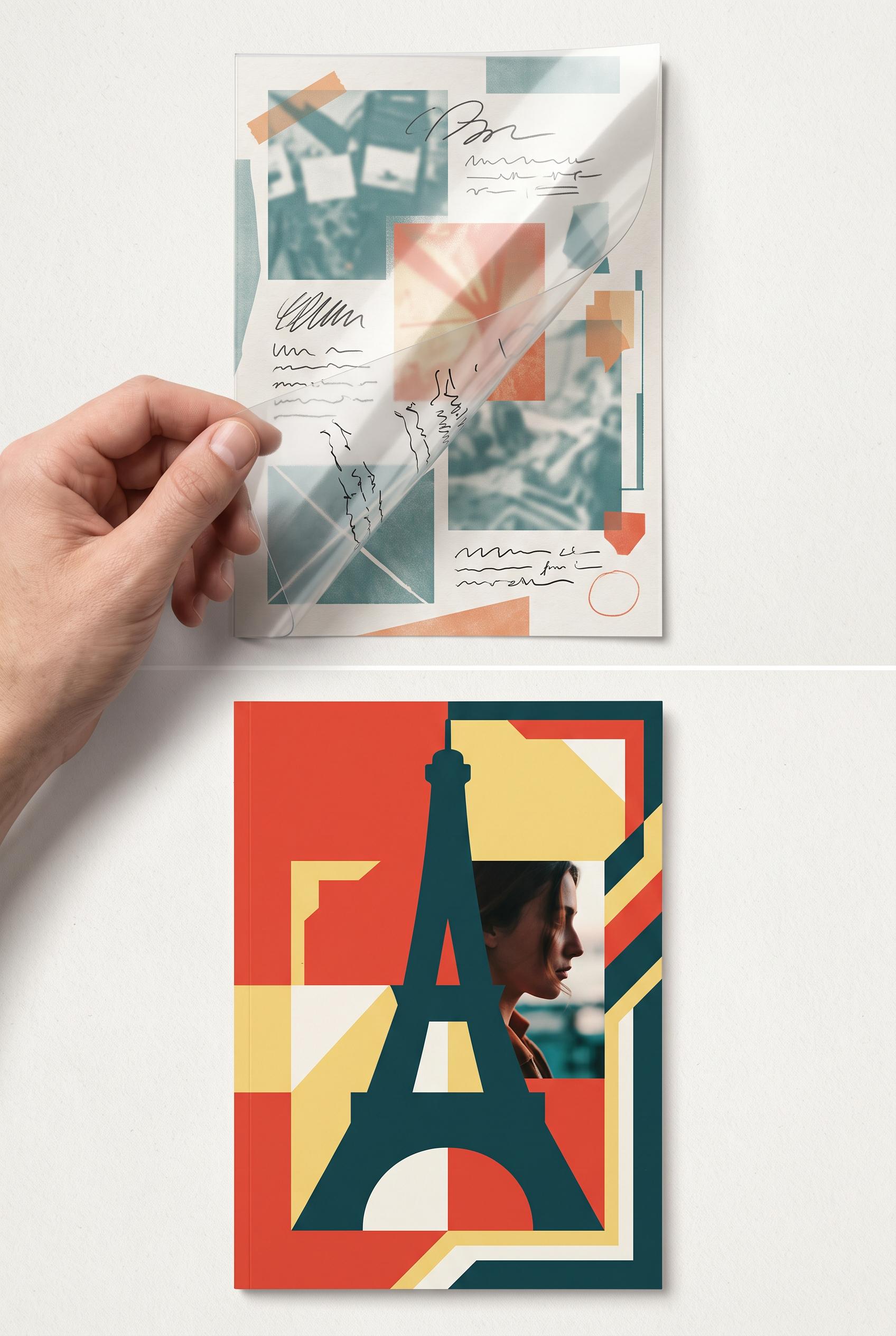
Create a commercial-quality editorial design case study in a vertical 2:3 Pinterest composition, showing a before-and-after transformation of a travel essay creator thumbnail. Use a tactile acetate overlay being lifted from a cluttered draft to reveal a confident cover with one abstract landmark silhouette, cropped human detail, strong directional framing, and no readable text. Palette: tomato red, butter yellow, dark teal, paper white. Premium studio lighting, realistic paper and acetate textures, refined art direction, no real brands, no trademarked characters, no watermark, no unintended readable text. Corrective regeneration attempt 2. Produce a materially revised image, not a near-duplicate of an earlier variant. Preserve the successful subject, palette, lighting, focal hierarchy, and commercial polish from the original brief while correcting every issue below. Mandatory corrective instructions from the most recent visual QA: Preserve the vertical 2:3 editorial composition, premium paper and acetate textures, lifted transparent overlay, tomato red/butter yellow/dark teal/paper-white palette, cluttered low-contrast draft above, and bold landmark silhouette with cropped human detail below. Remove every readable letter, word, label, handwritten note, arrow annotation, and typographic fragment from both panels; use only abstract image blocks, shapes, and texture. Remove the harsh horizontal white seam across the middle. Make the after panel a clean, polished cover with one oversized abstract landmark silhouette, directional geometric framing, and a cropped portrait detail, with no text-like glyphs or accidental lettering. Retain realistic hand, acetate reflections, shadows, and refined commercial styling; no watermark or brands. Observed defects from prior variants that must not recur: 1) Strong vertical composition, tactile acetate, palette, and clear before/after transformation. 2) Contains abundant unintended readable text, including “BEFORE,” “AFTER,” “TRAVEL,” and handwritten notes, despite the no-readable-text requirement. 3) A harsh horizontal white seam crosses the composition, and the cropped large lettering in the lower panel looks like an artifact rather than polished design. 4) The after panel is strong but the overall hierarchy is weakened by the text clutter and seam. Render no letters, words, numbers, prices, headings, labels, contact details, logos, glyphs, or pseudo-text anywhere. Use only blank surfaces, clean geometric marks, and non-linguistic placeholder shapes. Do not add explanatory captions, before/after labels, interface copy, or extra objects that the brief did not request. When a corrective instruction conflicts with a decorative detail, prioritize the corrective instruction.
Properties
Aspect Ratio
Resolution
Like what you see? Create your own with ai-media-studio.