Shared Image
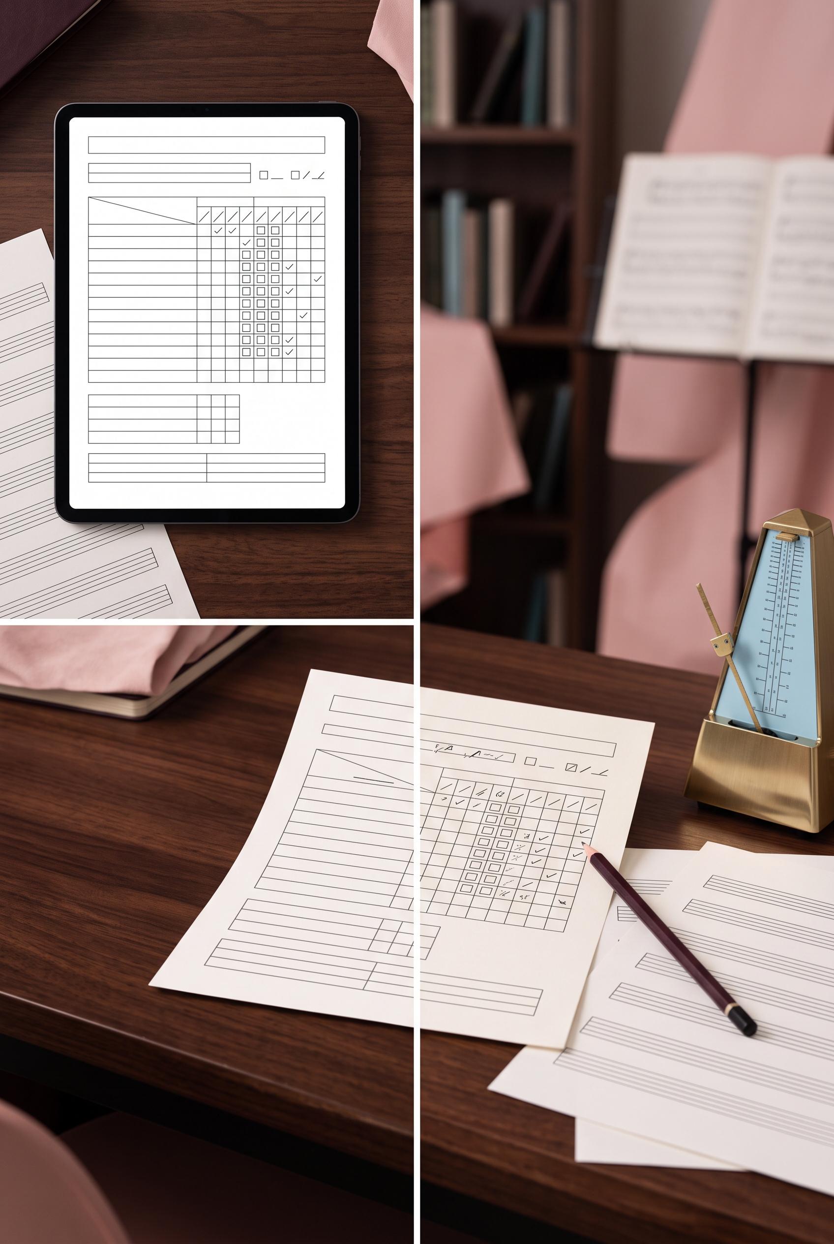
Prompt
Create a vertical 2:3 Pinterest composition with commercial-quality art direction for an editable music practice tracker listing. Show a before-and-after contact-sheet transition from a plain digital file preview to a used paper tracker on a musician desk, with sheet music, pencil, and metronome. Use black cherry, ice blue, brass, and blush. No real brands, no trademarked characters, no watermark, and no unintended readable text. Keep any interface elements abstract and illegible. Corrective regeneration attempt 3. Produce a materially revised image, not a near-duplicate of an earlier variant. Preserve the successful subject, palette, lighting, focal hierarchy, and commercial polish from the original brief while correcting every issue below. Mandatory corrective instructions from the most recent visual QA: Preserve the attractive vertical 2:3 split composition, black cherry/ice blue/brass/blush palette, desk lighting, metronome, pencil, sheet-music setting, and clear unused-to-used transition. Remove the top banner entirely. Render absolutely no letters, words, numbers, headings, labels, handwriting, logos, glyphs, musical notes, or pseudo-text anywhere. Replace all tracker text and entries with clean blank lines, empty boxes, geometric dividers, and abstract non-linguistic marks only. Keep the tracker structure professional and legible as a form without readable content. Make sheet music consist only of blank staff-like geometric lines with no notes or symbols. Ensure there is no watermark, brand mark, or generation artifact. Observed defects from prior variants that must not recur: 1) Strong vertical before/after composition with clear focal split and fitting desk props. 2) Obvious malformed readable text appears in the tracker, including strings like “AMSITACT” and “ADOTRACT,” reducing commercial polish. 3) Several labels and handwritten entries look like generated text artifacts rather than intentional abstract interface details. 4) Strong vertical split and attractive palette, lighting, metronome, pencil, and desk scene. 5) Fails the no-readable-text requirement: large banner text, tracker headings, labels, handwritten entries, numbers, and musical notation are all visible. 6) The top banner is an unrequested extra graphic element. Render no letters, words, numbers, prices, headings, labels, contact details, logos, glyphs, or pseudo-text anywhere. Use only blank surfaces, clean geometric marks, and non-linguistic placeholder shapes. Do not add explanatory captions, before/after labels, interface copy, or extra objects that the brief did not request. When a corrective instruction conflicts with a decorative detail, prioritize the corrective instruction.
Properties
Aspect Ratio
Resolution
Like what you see? Create your own with ai-media-studio.