Shared Image
Prompt
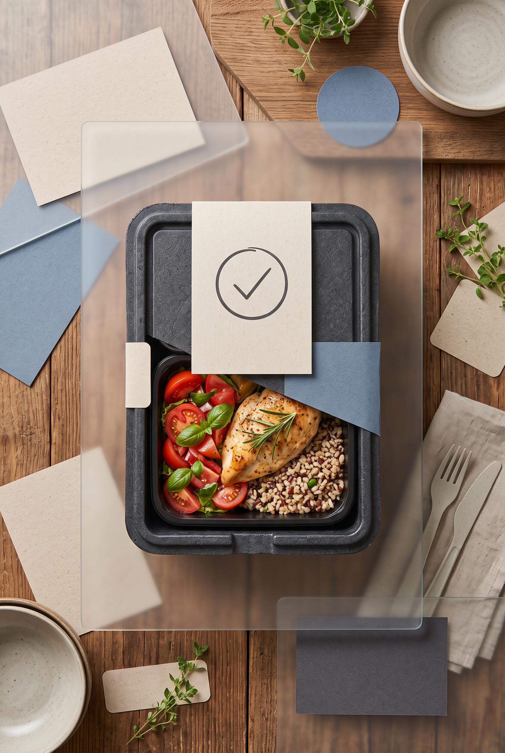
Create a commercial-quality AI-modified downstream Pinterest image in a vertical 2:3 composition for a neighborhood meal-prep service. Use an overhead tabletop scene with rotating translucent reveal panels, scattered generic menu cards transforming into one elegant meal box and pickup cue, tomato red, oatmeal, muted blue, and charcoal palette, tactile paper and food photography, premium small-business advertising art direction, no real brands, no trademarked characters, no watermark, no unintended readable text. Corrective regeneration attempt 2. Produce a materially revised image, not a near-duplicate of an earlier variant. Preserve the successful subject, palette, lighting, focal hierarchy, and commercial polish from the original brief while correcting every issue below. Mandatory corrective instructions from the most recent visual QA: Preserve the attractive overhead tabletop, vertical 2:3 framing, tomato-red/oatmeal/muted-blue/charcoal palette, realistic food photography, translucent reveal panels, and central meal box. Remove all readable lettering, logos, business names, seals, receipts, handwriting, menu titles, and labels. Replace every card and note with blank tactile paper or abstract non-text marks. Make the central hero a single elegant meal box with one prominent blank pickup cue card or simple non-linguistic calendar/checkmark icon, clearly communicating one weekly pickup promise without words. Reduce the number of competing objects and keep the meal box and pickup cue as the unmistakable focal point. Ensure there are no brand-like emblems, watermarks, garbled characters, or pseudo-text. Observed defects from prior variants that must not recur: 1) The image contains extensive unintended readable/generated text across the central panel, menu cards, package seal, pickup note, and receipt. 2) The package seal creates a brand-like identity with readable business wording, conflicting with the no-brand requirement. 3) The focal message does not clearly center on one weekly pickup promise; the composition is visually busy with multiple competing cards and documents. 4) The receipt and small notes contain visibly malformed or nonsensical text, failing the no-garbled-text requirement. Render no letters, words, numbers, prices, headings, labels, contact details, logos, glyphs, or pseudo-text anywhere. Use only blank surfaces, clean geometric marks, and non-linguistic placeholder shapes. Do not add explanatory captions, before/after labels, interface copy, or extra objects that the brief did not request. When a corrective instruction conflicts with a decorative detail, prioritize the corrective instruction.
Properties
Aspect Ratio
Resolution
Like what you see? Create your own with ai-media-studio.