Shared Image
Prompt
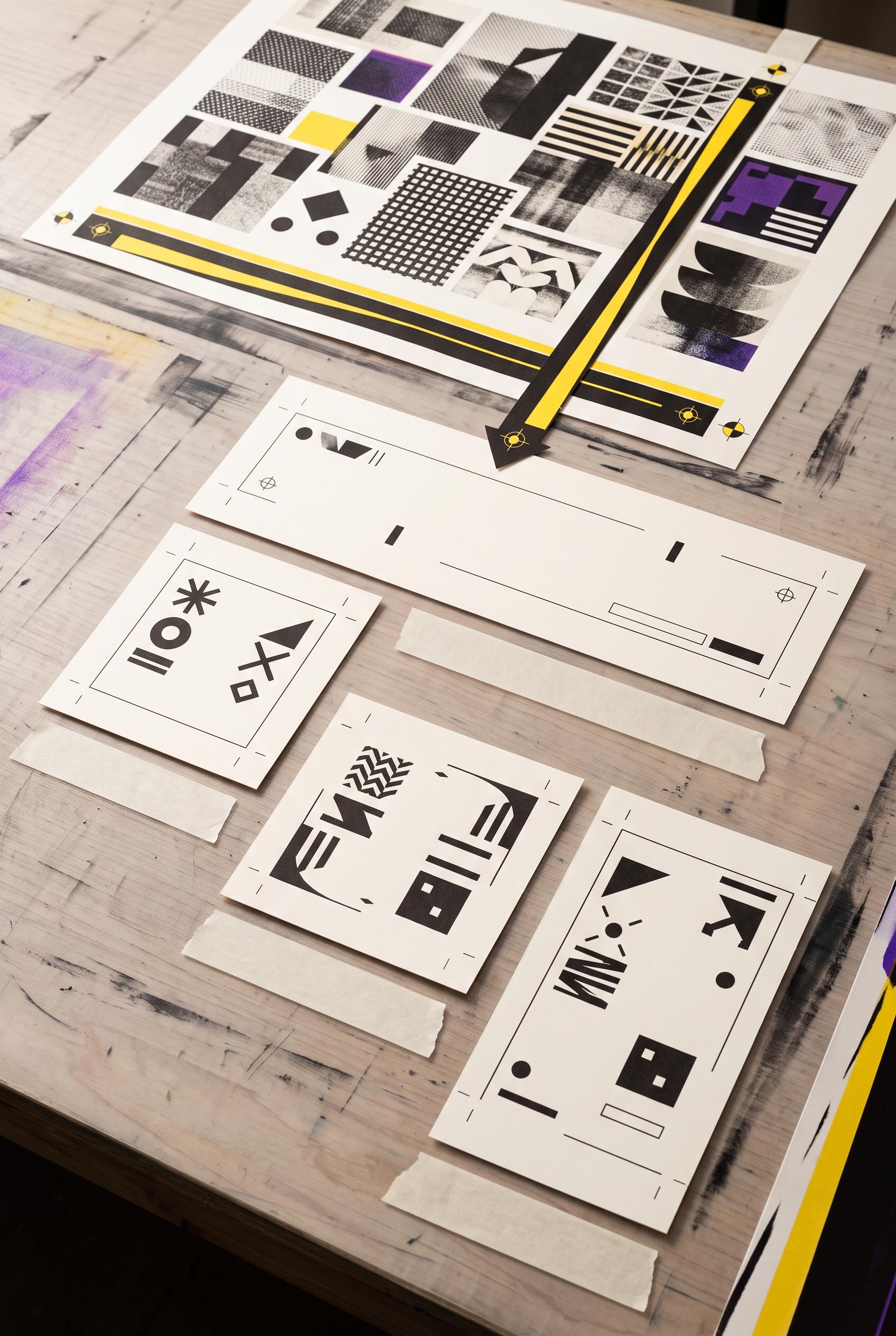
Vertical 2:3 Pinterest composition, commercial-quality art direction, useful editorial infographic on a print-shop worktable, one large abstract moodboard source at the top feeding four distinct paper proofs below through a bold diagonal crop path and registration marks: wide banner, square cover, portrait story frame, and round avatar, safety yellow, ink black, warm white, and ultraviolet accents, blank label strips and abstract symbols only, AI-modified downstream asset, no real brands, no trademarked characters, no watermark, no unintended readable text. Corrective regeneration attempt 5. Produce a materially revised image, not a near-duplicate of an earlier variant. Preserve the successful subject, palette, lighting, focal hierarchy, and commercial polish from the original brief while correcting every issue below. Mandatory corrective instructions from the most recent visual QA: Preserve the polished vertical 2:3 print-shop tabletop, top abstract moodboard, warm-white paper, ink black, safety yellow and ultraviolet palette, tactile print texture, soft shadows, bold diagonal crop path, and registration marks. Recompose the lower cascade to contain exactly four and only four separate paper proofs: one wide horizontal profile-banner proof, one square thumbnail-cover proof, one separate square carousel-opener proof with a clearly different crop and abstract symbol arrangement, and one tall portrait story-frame proof. Remove the round avatar/disc entirely and remove every extra sheet, duplicate, or stacked proof. Keep the four proofs fully visible, clearly separated, and visibly fed by the single moodboard through the diagonal path. Use only blank surfaces, clean geometric marks, and unique non-linguistic symbols; render no letters, words, numbers, labels, pseudo-text, logos, watermarks, or recognizable brands. Observed defects from prior variants that must not recur: 1) The composition is polished and clearly shows a moodboard-to-print workflow, but the requested four outputs are not faithfully represented: a ROUND AVATAR is shown instead of a cle 2) Visually polished vertical 2:3 composition with strong focal hierarchy and no obvious watermark or real branding. 3) The workflow is not brief-accurate: it shows five output proofs, including an extra “AVATAR PROOF.” 4) The thumbnail cover and carousel opener are both labeled “COVER PROOF,” so the four required deliverables are not clearly distinguished. 5) The lower cascade visibly contains five output proofs, including an extra round avatar, instead of exactly four required deliverables. 6) The extra circular proof and overlapping portrait sheets weaken the clear, countable workflow and do not cleanly distinguish the carousel opener from the other outputs. Render no letters, words, numbers, prices, headings, labels, contact details, logos, glyphs, or pseudo-text anywhere. Use only blank surfaces, clean geometric marks, and non-linguistic placeholder shapes. Do not add explanatory captions, before/after labels, interface copy, or extra objects that the brief did not request. When a corrective instruction conflicts with a decorative detail, prioritize the corrective instruction.
Properties
Aspect Ratio
Resolution
Like what you see? Create your own with ai-media-studio.