Shared Image
Prompt
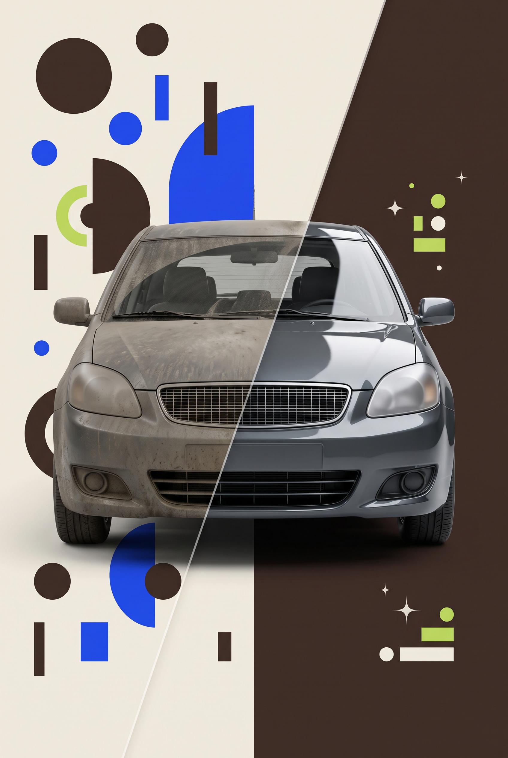
Commercial-quality Pinterest marketing visual for an independent auto detailing service, vertical 2:3 composition, translucent acetate wipe reveal across one consistent vehicle scene, left side visually cluttered with competing icons and scattered shapes, right side refined with glossy highlights and one strong offer cue, espresso brown, electric blue, cream, and lime palette, crisp studio lighting, premium small-business advertising art direction, no real brands, no trademarked characters, no watermark, no unintended readable text. Corrective regeneration attempt 5. Produce a materially revised image, not a near-duplicate of an earlier variant. Preserve the successful subject, palette, lighting, focal hierarchy, and commercial polish from the original brief while correcting every issue below. Mandatory corrective instructions from the most recent visual QA: Preserve the vertical 2:3 composition, diagonal translucent acetate wipe, espresso brown/electric blue/cream/lime palette, crisp studio lighting, strong front-facing vehicle focal point, and dirty-to-glossy transformation. Redesign the exact same vehicle on both sides with fully generic automotive styling: plain rectangular grille with neutral mesh, generic headlights, no luxury-brand cues, badges, emblems, or distinctive contours. Replace every left-side decoration with sparse, irregular abstract circles, rectangles, arcs, and color blocks that cannot resemble letters, numbers, symbols, icons, or pseudo-text; remove all stacked bars and glyph-like forms. On the polished side use only a tiny restrained cluster of simple lime-and-cream geometric shapes and a few subtle sparkle points; remove the squiggle and all pictogram-like marks. Keep all vehicle surfaces blank and include no text, labels, numbers, logos, watermark, buttons, badges, calendars, phones, clocks, arrows, or other recognizable symbols. Observed defects from prior variants that must not recur: 1) Left-side decorative marks resemble letters and pseudo-text, violating the no-readable or text-like marks requirement. 2) The vehicle grille is strongly recognizable as a specific automotive brand style. 3) The two vehicle views do not match closely enough as one consistent scene and perspective. 4) The right-side clock/arrow symbol is too prominent relative to the required restrained offer cue. 5) The grille and headlight styling strongly resemble a recognizable luxury automotive brand. 6) Left-side decorations include symbol-like marks and stacked bars that can read as pseudo-text or glyphs. 7) The right-side decorative cluster includes a squiggle and multiple pictogram-like shapes rather than restrained nonverbal accents. 8) The vehicle is visually polished, but the corrective requirements for generic styling and purely abstract marks are not met. Render no letters, words, numbers, prices, headings, labels, contact details, logos, glyphs, or pseudo-text anywhere. Use only blank surfaces, clean geometric marks, and non-linguistic placeholder shapes. Do not add explanatory captions, before/after labels, interface copy, or extra objects that the brief did not request. When a corrective instruction conflicts with a decorative detail, prioritize the corrective instruction.
Properties
Aspect Ratio
Resolution
Like what you see? Create your own with ai-media-studio.