Shared Image
Prompt
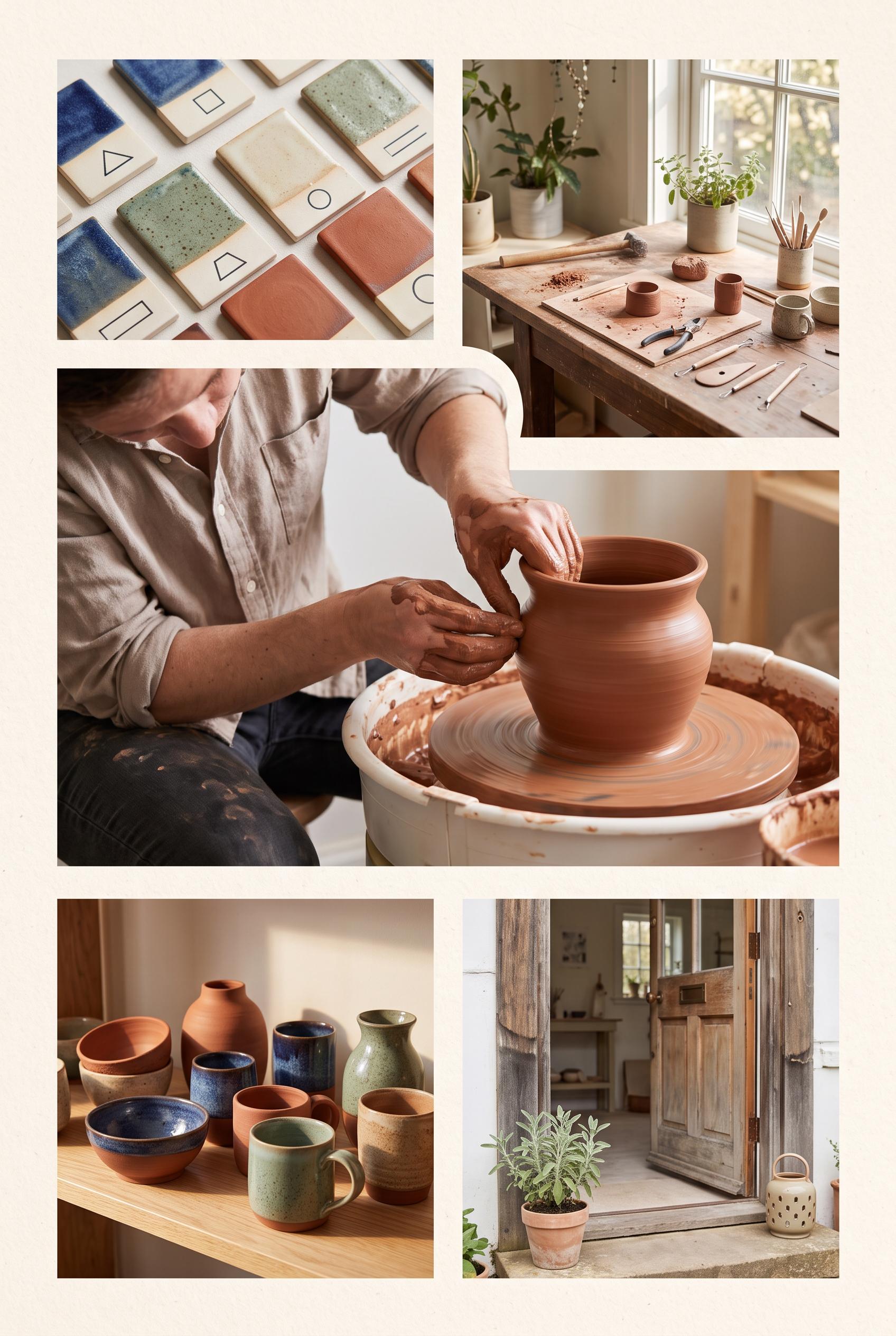
Create a commercial-quality vertical 2:3 Pinterest composition as an inspirational showcase for an independent pottery studio open house. Use an editorial contact sheet with one large hero scene and four smaller photographic moments: hands shaping clay, glaze samples, a sunlit worktable, and finished vessels. Use terracotta, indigo, sage green, and warm cream. AI-modified downstream. No real brands, no trademarked characters, no watermark, and no unintended readable text. Corrective regeneration attempt 2. Produce a materially revised image, not a near-duplicate of an earlier variant. Preserve the successful subject, palette, lighting, focal hierarchy, and commercial polish from the original brief while correcting every issue below. Mandatory corrective instructions from the most recent visual QA: Preserve the polished vertical 2:3 editorial contact-sheet style, warm cream paper framing, terracotta/indigo/sage palette, soft natural light, and tactile pottery photography. Make the large dominant hero panel clearly show a maker shaping clay at a wheel. Use four smaller panels for: glaze tests, a sunlit worktable, finished vessels, and a welcoming studio entry moment with an inviting doorway. Remove all embedded words, captions, labels, signage, logos, watermarks, and other readable text; keep every image free of garbled details and generation artifacts. Observed defects from prior variants that must not recur: 1) Attractive vertical contact-sheet composition with strong palette and photography. 2) The required hero image of a maker shaping clay is relegated to a smaller panel; the hero is shelving instead. 3) No clear welcoming entry moment is shown. 4) The graphic contains substantial embedded readable copy and labels, which are not requested and create avoidable text-generation risk. Render no letters, words, numbers, prices, headings, labels, contact details, logos, glyphs, or pseudo-text anywhere. Use only blank surfaces, clean geometric marks, and non-linguistic placeholder shapes. Do not add explanatory captions, before/after labels, interface copy, or extra objects that the brief did not request. When a corrective instruction conflicts with a decorative detail, prioritize the corrective instruction.
Properties
Aspect Ratio
Resolution
Like what you see? Create your own with ai-media-studio.