Shared Image
Prompt
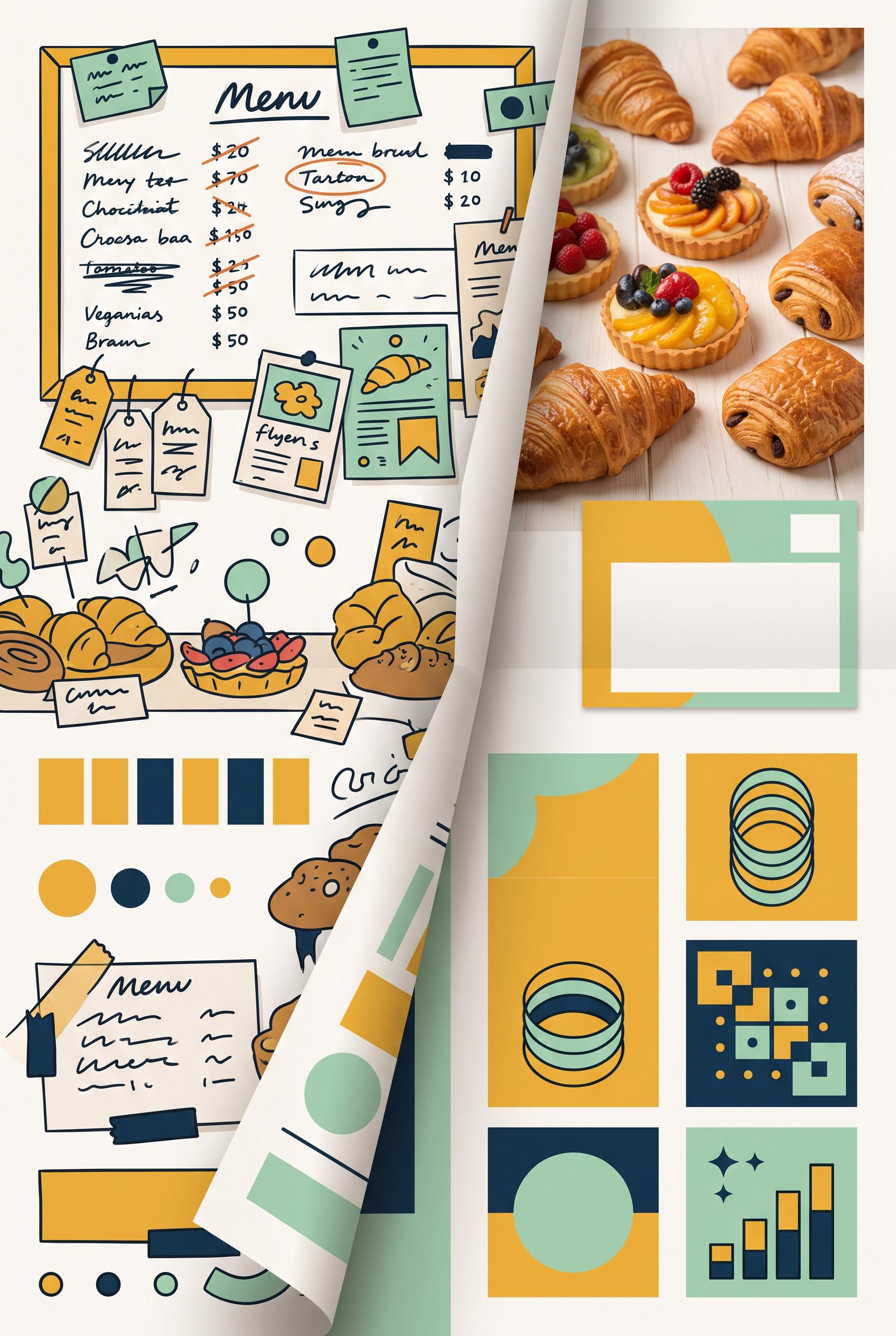
Create a commercial-quality Pinterest marketing visual in a vertical 2:3 composition showing a before-and-after transformation for a fictional neighborhood bakery preorder campaign. Use a folded paper reveal, left side visually cluttered and right side clean and focused, with pastry photography, a simple pickup card, and three abstract information blocks. Use saffron yellow, deep ink blue, mint green, and warm white. AI-modified downstream. No real brands, no trademarks, no trademarked characters, no watermark, and no unintended readable text. Corrective regeneration attempt 3. Produce a materially revised image, not a near-duplicate of an earlier variant. Preserve the successful subject, palette, lighting, focal hierarchy, and commercial polish from the original brief while correcting every issue below. Mandatory corrective instructions from the most recent visual QA: Preserve the attractive vertical 2:3 composition, bakery photography, saffron yellow/deep ink blue/mint/warm-white palette, folded-paper split, cluttered left side, focused right pastry hero, pickup-card shape, and three lower detail insets. Remove every readable or letter-like mark: erase all menu-board writing, product tags, prices, headline text, call-to-action text, and inset scribbles. Replace them with blank surfaces, solid geometric bars, dots, circles, simple non-linguistic abstract shapes, or indistinct texture only. Remove recognizable letters, numbers, words, pseudo-handwriting, logos, watermark, and brand-like marks everywhere. Keep the before/after hierarchy clear through layout, contrast, and color without labels or captions. Do not add any explanatory text or extra objects. Observed defects from prior variants that must not recur: 1) Strong vertical composition, clear before/after focal point, tactile folded-paper reveal, and appealing bakery imagery. 2) Numerous labels are clearly readable despite the brief requiring all labels to be abstract or unreadable, including the headline, BEFORE/AFTER, PICKUP CARD, ORDER NOW, and menu-not 3) The lower detail insets also contain readable ordering text and symbols that should be abstracted. 4) Numerous clearly readable words, numbers, prices, and labels appear throughout the menu board, product cards, pastry tags, and lower insets. 5) The bottom call-to-action contains readable letterforms, violating the requirement for no text or glyphs. 6) Lower inset graphics include pseudo-writing and recognizable interface symbols rather than purely abstract non-linguistic shapes. Render no letters, words, numbers, prices, headings, labels, contact details, logos, glyphs, or pseudo-text anywhere. Use only blank surfaces, clean geometric marks, and non-linguistic placeholder shapes. Do not add explanatory captions, before/after labels, interface copy, or extra objects that the brief did not request. When a corrective instruction conflicts with a decorative detail, prioritize the corrective instruction.
Properties
Aspect Ratio
Resolution
Like what you see? Create your own with ai-media-studio.