Shared Image
Prompt
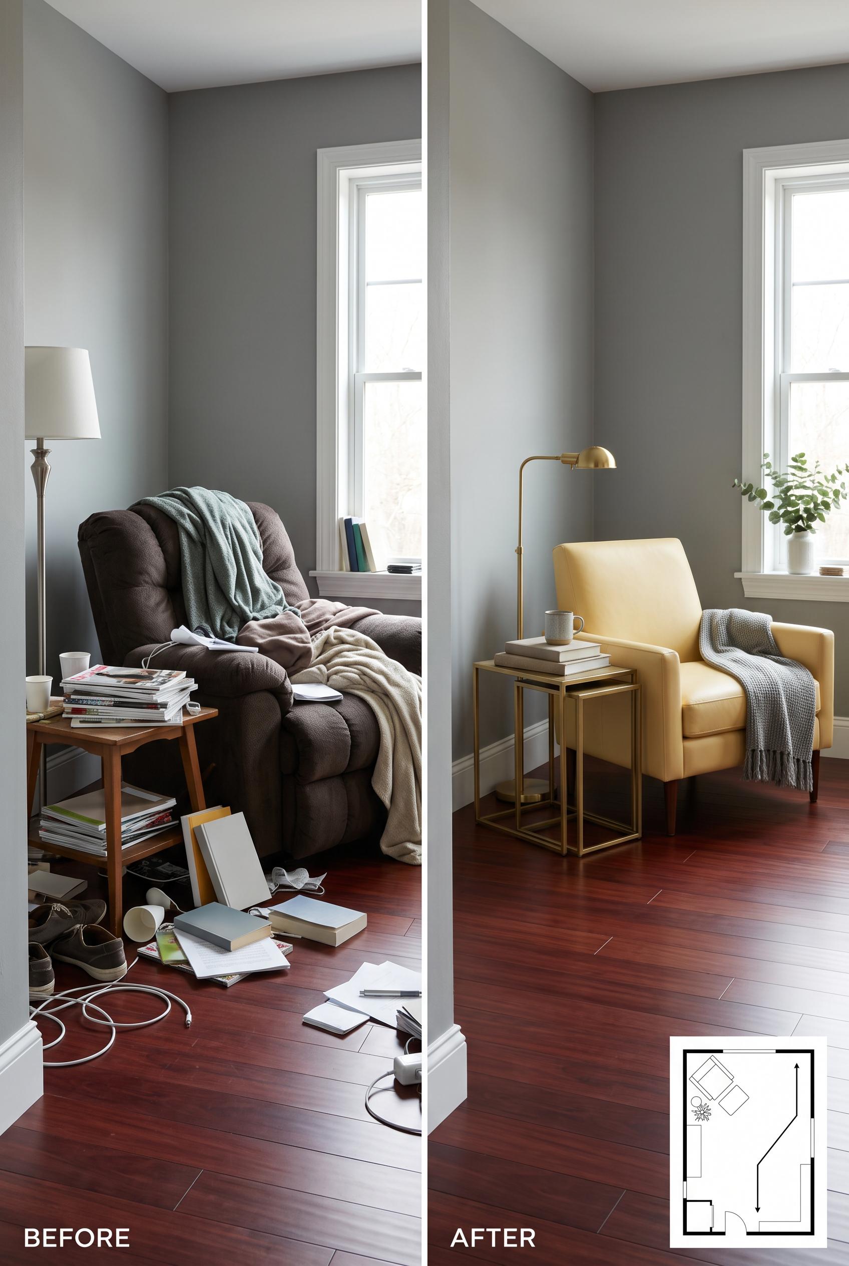
Create a commercial-quality interior editorial image in a vertical 2:3 Pinterest composition, using a matched before-and-after split of the same compact living room. Show a cluttered recliner corner on one side and a flexible reading and conversation arrangement on the other, with butter yellow upholstery, mineral gray walls, eucalyptus textiles, and dark cherry wood accents. Include a small abstract floor plan inset with no readable labels. Use realistic materials, soft directional daylight, refined styling, no real brands, no trademarked characters, no watermark, and no unintended readable text. AI-modified downstream. Corrective regeneration attempt 2. Produce a materially revised image, not a near-duplicate of an earlier variant. Preserve the successful subject, palette, lighting, focal hierarchy, and commercial polish from the original brief while correcting every issue below. Mandatory corrective instructions from the most recent visual QA: Preserve the polished vertical split-screen composition, matched mineral-gray room, butter-yellow lounge chair, eucalyptus textiles, cherry flooring, soft daylight, and slim brass floor lamp. In the after panel, replace the round side table with a clearly narrow nesting table set, positioned compactly beside the chair, and leave an unmistakable open diagonal walking path across the floor from the room entrance toward the seating area. Keep the before panel cluttered with the bulky recliner and scattered tables, but make every magazine, book, and paper cover blank or abstract with no readable letters, words, logos, or numbers. Retain a small clean abstract floor-plan inset showing the improved turning space, with no labels or text, and ensure there are no watermarks or generation artifacts. Observed defects from prior variants that must not recur: 1) The after arrangement uses a round side table rather than the specified narrow nesting table. 2) The intended clear diagonal circulation path is not strongly legible because the chair and table occupy the main floor area. 3) Several magazine/book covers contain small, potentially readable incidental text, contrary to the no unintended readable text requirement. Render no letters, words, numbers, prices, headings, labels, contact details, logos, glyphs, or pseudo-text anywhere. Use only blank surfaces, clean geometric marks, and non-linguistic placeholder shapes. Do not add explanatory captions, before/after labels, interface copy, or extra objects that the brief did not request. When a corrective instruction conflicts with a decorative detail, prioritize the corrective instruction.
Properties
Aspect Ratio
Resolution
Like what you see? Create your own with ai-media-studio.