Shared Image
Prompt
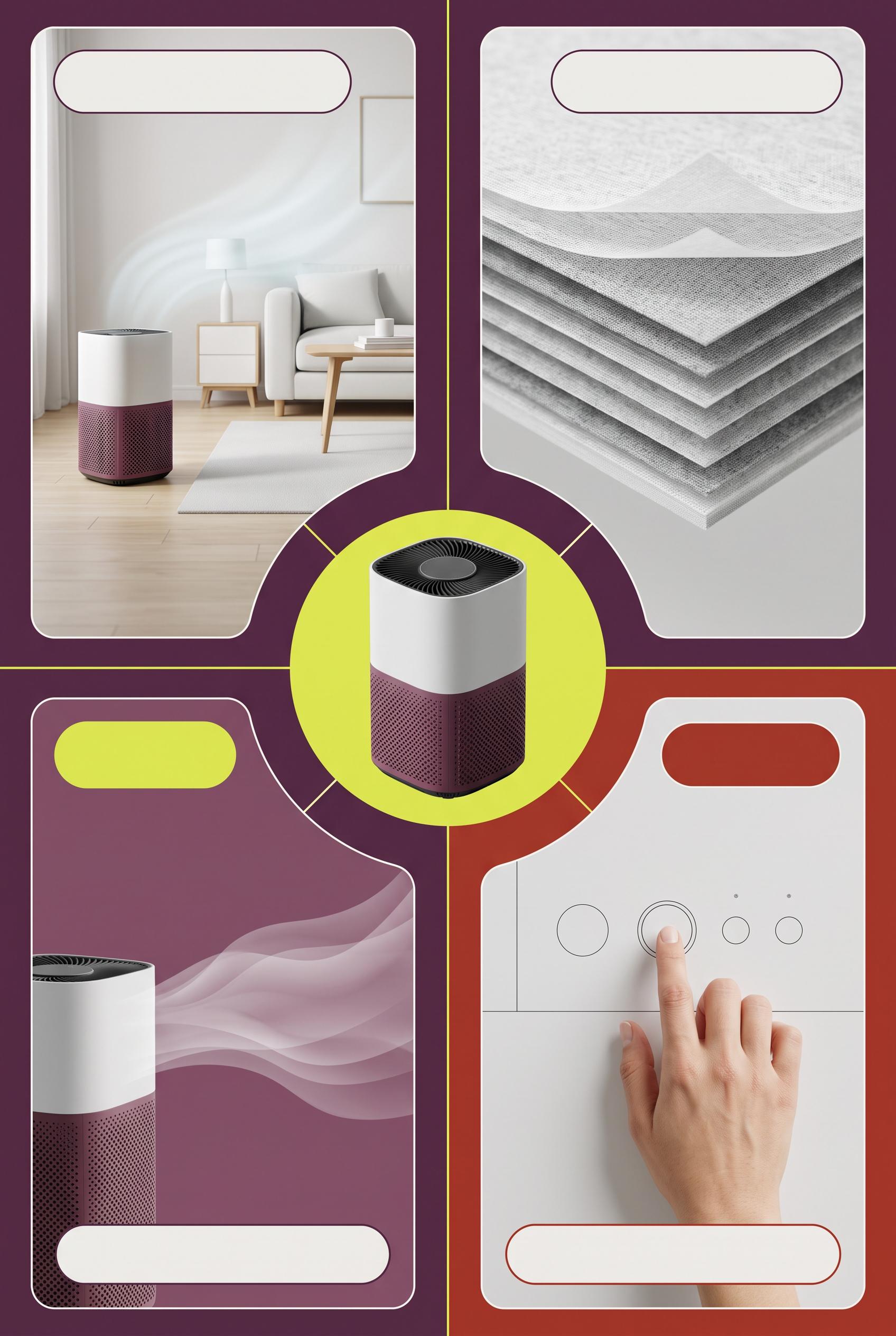
Create a commercial-quality educational campaign board in a vertical 2:3 Pinterest composition. Place an unbranded compact air purifier at the center of a radial layout with four clearly separated visual proof panels around it: room scale, filter texture, quiet airflow shown with soft translucent waves, and a hand adjusting a simple control. Use plum, citron, fog white, and oxide red with thin graphic connectors and blank label areas. AI-modified downstream. No real brands, no trademarked characters, no watermark, and no unintended readable text. Corrective regeneration attempt 4. Produce a materially revised image, not a near-duplicate of an earlier variant. Preserve the successful subject, palette, lighting, focal hierarchy, and commercial polish from the original brief while correcting every issue below. Mandatory corrective instructions from the most recent visual QA: Preserve the strong vertical 2:3 radial composition, central compact unbranded purifier, four distinct proof panels, plum/citron/fog-white/oxide-red palette, thin connectors, filter detail, room-scale scene, soft airflow waves, blank rounded label areas, and premium lighting. Reframe the lower-right control close-up so the entire hand, wrist, and fingertip are comfortably inside the panel with generous margins on every side; do not crop any part of the hand or forearm. Keep the anatomy natural. Remove every interface glyph, power icon, dot indicator, letter, word, number, label, logo, watermark, pseudo-text, and trademark. Show only simple blank circular controls and clean geometric forms. Observed defects from prior variants that must not recur: 1) The duplicated “SIMPLE CONTROL” label and large headline compete with the visual focal point. 2) The lower-right hand is awkwardly cropped at the edge, reducing polished commercial quality. 3) The lower-right control panel crops the hand/forearm at the right edge, contrary to the required fully visible natural hand framing. 4) The composition otherwise has a strong vertical layout, clear central purifier, four distinct image-led panels, clean blank label areas, appropriate palette, and no visible text,3D 5) watermark, or branding. 6) The lower-right control panel crops the hand and wrist against the right edge, violating the required generous framing. 7) The control panel contains small interface-like glyphs and symbols, contrary to the instruction to render no glyphs or pseudo-text. 8) The hand anatomy/framing is not fully polished for commercial use. Render no letters, words, numbers, prices, headings, labels, contact details, logos, glyphs, or pseudo-text anywhere. Use only blank surfaces, clean geometric marks, and non-linguistic placeholder shapes. Do not add explanatory captions, before/after labels, interface copy, or extra objects that the brief did not request. When a corrective instruction conflicts with a decorative detail, prioritize the corrective instruction.
Properties
Aspect Ratio
Resolution
Like what you see? Create your own with ai-media-studio.